full colour spread
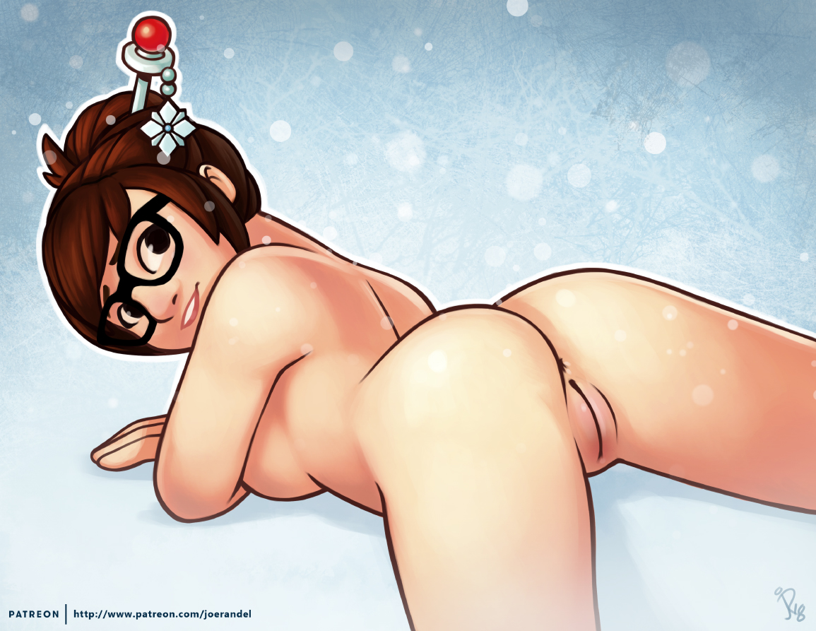
 This pic took me so long to get done! I just couldn’t get the hands right. It was so frustrating! I think I have them down now though. How do they look? Funny that this started as a “lets draw an open puss” picture and it ended up being a study on hands. o_O This was also an excuse to practice more anime style stuff. I’m not looking to switch over to anime or anything, but I do really enjoy their designs and colouring.
Not much more other then that really. I’m pretty happy with how it came out. Now on to another pic. ^_^
 Play Asia
September 22nd, 2010 at 12:07 am
Unf… And I thought the lines were good!
That vageen is just PERFECT.
September 22nd, 2010 at 2:36 am
0.o homina homina homina…..
*Ahem* Excuse me.
Now then, I think this pic turned out great. The two things I noticed, (and I probably wouldn’t have if you hadn’t said anything), is about mid knuckle on her hands, the black lines disappear and the fingers seem to merge together. Is that a shadow effect?
Secondly, at the tips of her fingers, except the pinkies, have a light color that makes them look like claws or fake nails. I’m guessing it’s a light source angle, but I dunno, not an artist.
Yeah I’m not sure how to phrase that without sounding like an ass… I really do like your pic.
September 22nd, 2010 at 3:23 am
Ha!
Cinos (I have a long nail fetish, for maximum stimulation, you check out some of the Asian pornstars fom the 80s (Mai Lin, Linda Wong…) they will slay you with their amazingly long nails. I get shivers.
Joe, I myself am not bothered by the dissapearing lines, I see that as a stylistic choice, you don’t need to outline everything IMO. As stated above, wouldn’t mind seeing that feline quality of nails added to the finger tips.
Her hands look good for the most part, where I would consider tweaking would be, A) Making them curve or bend more, she’s pulling herself open, right? They look a little too straight for that. B) adding some shading to her leg’s where her finger tips are as they would be pressing into the skin a bit. You have some subtle shading going on, it would help to emphasize her pulling on her skin to have shading around the finger tips. C) Her face bugs me a little, it’s hovering between being foreshortened, and not. (Does that make sense?) – her overall face is very round, and the bottom of her nose should be higher up if foreshortened, or her face should be “longer”.
BTW, I prefer this image to the simpler one you posted on HF. That’s why I cam here because I figured the honey would be sweeter in this image. yep.
Hope my comments are useful – ciao!